
The following are my takeaways for the Neilsen Norman Group’s Usability Week session titled ‘Visual Design for Mobile & Tablet: Day 1’ (Austin, Texas) by Aurora Bedford:
With mobile or web application their are three attributes that need to be apparent… where, what, and how. For example, if your conducting application usability testing, you don’t want users ever stating, “I’m not sure where to go.” Likewise, for ‘what’ you don’t what users stating “I’m not sure what to do/ what this will do,” and for ‘how’ you don’t want a user stating “I don’t know how to do this.” You won’t encounter these problems if your applications have large and obvious targets, meaningful interaction, and there are clear actions.
Large and obvious targets
1 centimeter by 1 centimeter is the cross-platform size to use for touch elements on a mobile/web application (Apple is 44pt, Android is 48 dp, and Windows 34px). Also, the optical square needs to be surrounded to make a full asset (fig. 1), and at least 10px is required (but more is preferable).
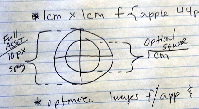 Fig. 1. Sketch of a full touch asset. Author’s sketch.
A huge part of interaction design is also realizing how your user is holding and using different mobile devices (fig. 2), and to test this usability-wise it may be beneficail to use a Mr. Tappy or similar camera.
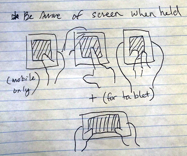 Fig. 2. Sketch of a how people use mobile devices. Author’s sketch.
Meaningful interactions
All in all, for Android, Firefox, iOS, and Windows mobile devices tab bars always make the most sense due to all of the different ways the users use tablets and mobile phones (fig. 3). So, it is imperative that tab bars are not only in the optimal clicking space, but all repetitive interactions should be housed in the tab bar (with less tap precision).
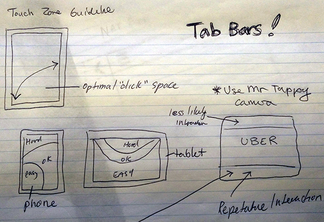 Fig. 3. Sketch of a optimal tablet and mobile spaces. Author’s sketch.
Also, the concept of tab bars needing to be on the bottom for iOS devices because there is only one button on iPhones, and that tab bars are on the top of Android devices because there are three android buttons, is just a matter of preference; neither one is better or worse, and apps like Instagram, Uber, etc. all create the same UX across device platforms.
So web applications should definitely use and take advantage of tab bars that:
- Persists for all mobile and tablet devices
- That stays the same height
- Conserve real estate with few links, fly-outs, or horizontal scrolling.
- Use labels as opposed to non-universal iconography (fig. 4)
- Is easy to touch and easy to understand
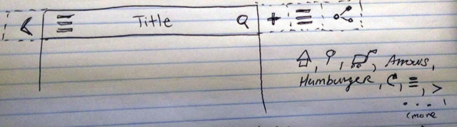 Fig. 4. Sketch of universal icons. Author’s sketch.
Clear Actions
- Links on mobile in body copy, or anywhere, need to stand out… make them consistent throughout your web application; border-bottom 1px links are definitely used for mobile link recognition.
- Stay away from overuse of bold styling as it can be viewed as a link.
- Expected areas that are tap-able links, should (example: reviews).
- Links should be contextual, and use action words that call to action.
- Buttons shouldn’t be border-less or flat; there needs to be some type of shadow or bevel. Bottom and right shadows look like buttons, and left and top look like depressed buttons; primary actions should stand out.
Also…
- Use visual contrast – color, size, style, and weight – to draw attention to primary actions.
- USe skeuomorphism sparingly and when it helps.
- iOS uses 3 densities and Android uses 6 densities, so for web applications use SVGs as much as possible, as well as image place holders with adaptive images.
- Avoid overusing icons or just using icons for decoration
- Use layout indicators whenever possible, and use them consistently (fig. 5)
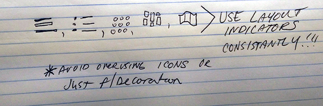 Fig. 5. Sketch of layout indicators. Author’s sketch.
https://twitter.com/tim_broadwater/status/596068181384384514