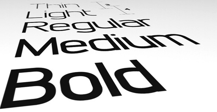
I think that the reason why the debate between sans serif and serif fonts still continues within the design and typographic community is mainly due to misconceptions of readability as it is facilitated by technology. For example, in the last seven years as a web design I have witnessed a lot of comparisons of the video and website mediums to paper.
Specifically, I can’t tell you how many times I have heard in design meetings, while talking to clients, and when discussing projects with stakeholders – no matter if the people involved are younger or older – references to print terminology like ‘above the fold’, DPI (dots per inch) or inches in general, or ‘printer-friendly’. Yes, it is good web design practice to include a print.css (cascading stylesheet) with a ‘@media print {‘ media query, but you can’t contextualize a medium like the web as paper.
The truth in the reading is indeed that the research shows no detectable improvement in readability between serif and sans serif typefaces, whether the print is on paper or on-screen, and this isn’t the only misconception. Along with these misconceptions for on-screen versus paper fonts are that websites scroll so everything doesn’t need to b on screen, everyone’s screen resolution and font size are set different from computer to computer, and resolution is pixel dimensions on-screen.
Many designers and typographers have maintained that “serifs help to guide the reader’s eye across the page” (Haley). However, this isn’t true because the eye doesn’t move across the page in one smooth sweep, but instead jumps from one series of words to another. Indeed, serifs have no effect on guiding the reader’s eye, but conversely some designers and typographers believe that the appearance of sans serif typefaces tends to tire the eye in lengthy text composition.
All in all it seems like the debate is a bunch of misconceptions that are passed from designer to designer, teacher to student, and experienced professional to design neophyte. I’ve even heard from individuals that some studies suggest that serif typefaces may be more readable than a sans in print regarding on-screen typography, but this is also a bunch of speculation which ultimately resolves to screen refresh rates, font size, brightness, and contrast.
So, for me an in my professional experience, the steps I would suggest for someone to better understand the qualities that make type readable as it pertains to web design, would be to know general rules for web typography and to know all of the CSS text properties.
Sources:
Haley, Alan. Fontology: Serif v. Sans for Text. Fonts.com. <http://bit.ly/1pofiyD>

