“The Grid” has influenced the fields, and related professions of, visual art, typography, and design (including web development) over the course of the 20th century, and it’s important for designers to understand how it has historically evolved, its influence on design and visual art, and how it will impact design and visual communication fields in the future, which includes software and technology.
When looking at how “the grid” historically has evolved and has affected modern design, fine art and typography, one must look specifically at the 20th century. The 20th century was the period between January 1, 1901 and December 31, 2000, but is distinct from the century known as the 1900s, which began on January 1, 1900 and ended December 31, 1999. The 20th century saw such scientific discoveries as the theory of relativity and quantum physics – which drastically change worldviews – and is thought of as having more technological and scientific progress than all the other centuries combined, especially since the century started with horses and simple automobiles, but ended with global commercial air travel and the space shuttle (20th-century.net).
However, not all of the 20th century was innovation and progress. The 20th century also saw the first global-scale wars with World War I and World War II, the beginning of global pollution, and the onset of negative environmental impact from the human race’s commercial and industrial use of fossil fuels. Human beings, starting in the 20th century, by virtue of their conduct “burning sources of carbon, fossil fuels among them that have been buried for millions of years – carbon that was previously underground – is now in the atmosphere, and that source of carbon makes carbon dioxide, a greenhouse gas that is warming the earth” (Tyson).
Additionally, the fine art, graphic design, printing, and typographic fields were greatly affected in the 20th century, and technological means for communication, distribution, and mass production would affect “the grid” as it would come to be known. During World War I (1914 – 1918) one could see the use of a grid mechanism as a visual guide became versatile, and experimentation in different divisions of composition, altering the visual grids or guides, and rotating typeface became common. An example of this can be seen in the work of the Dadaist Tristan Tzara (see fig. 1).
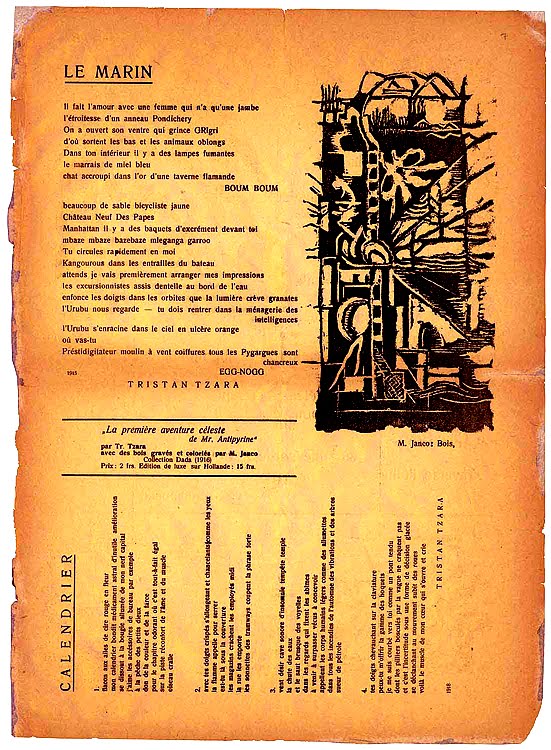
Figure 1 Tristan Tzara, Contents (Dada 3), 1917. Periodical.
In other design and typographical work of the Dadaist Tzara, one can see experimentation with grid-like structures; with typographic color, image placement, type opacity, element placement, and even layering of different elements (see fig. 2).
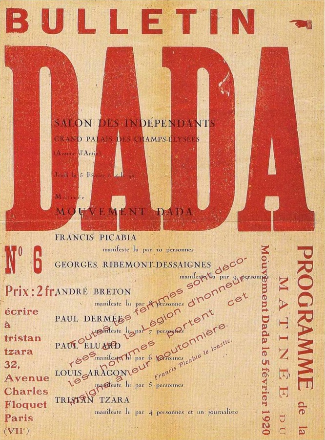
Figure 2 Tristan Tzara, Bulletin Dada, no. 6, 1920. University College London, Special Collections.
Additionally, after World War I, the post-war De Stijl movement in the Netherlands had a significant impact on graphic design going forward, with the use of grid aesthetics in both book and journal design. The artistic philosophy that identified the group was known as neoplasticism (the ‘new plastic art’), and the artists and designers of De Stijl sought to express a new utopian ideal of harmony and order through pure abstraction, universality, reduction of form and color. Characteristics of how a grid aesthetic were used in the De Stijl movement can be seen in the works of Bart van der Leck (see fig. 3), and employed open and simplified visual compositions, colors, and typography.
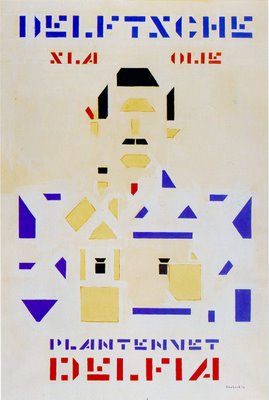
Figure 3 Bart van der Leck, Delft Salad Dressing, 1919. 34 x 23 ½ in. Berman Collection.
Suprematism took the principles of ‘the grid aesthetic’ as used by the De Stijl movement even further by focusing solely on grid compositions presented with only basic geometric shapes, limited ranges of color, and with bold sanserif typefaces; an example of this can be seen in Alexander Rodechenko’s poster Dobrolet (see fig. 4), or the use of photograph, typography, and actually referencing a grid in El Lissizky’s 1924 work The Constructor (see fig. 5).
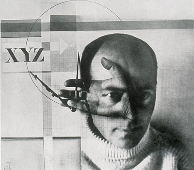
Figure 4 Alexander Rodchenko, Dobrolet, 1923. 13 x 17 ½ in. MOMA, NY.

Figure 5 El Lissitzky, The Constructor, 1924.
In April 1919 the Bauhaus school was founded by Modernist Walter Gropius in Weimar, Germany and in its wake came the most progressive movement in typography of the 1920s Jan Tschichold – a typographer, book designer, teacher and writer – had converted to Modernist design principles in 1923 after visiting a Bauhaus exhibition, and developed his most noted work Die neue Typographie (‘The New Typography’). Tschichold’s The New Typography was a manifesto of modern design which asserted the use of only sans-serif typefaces, favored non-centered design, and posited many other Modernist design rules such as standardized paper sizes for printing, and proclivities for the effective use of different sizes and weights of type in order to quickly and easily convey information. In his book, Tschichold also referenced the use of the ‘Van de Graaf canon‘ (a historical reconstruction of the Villard Diagram), and with the Bauhaus designers, developed what is known today as ‘Modern Typography’; likewise, the term “graphic design” was first coined around this time (1922) by William Addison Dwiggins, an American type designer, calligrapher, and book designer. These two significant establishments – modern typography and graphic design – would effectively define “the grid” going forward.
From 1920 – 1940 one can see the invention of new sanserif typefaces, and an increased emphasis on composition experimentation in advertising, as affected by The New Typography. An example of this can be seen in Alexey Brodovitch’s Harper’s Bazaar spread (see fig. 6). In the Harper’s Bazaar spread one can see the liberation of typography to actually mimic the shape of an accompanied photograph, and it isn’t until 1944 that one can see a greater experimentation with typography and photo-montage.
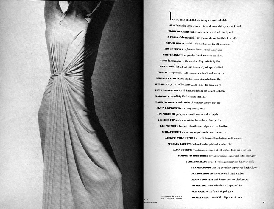
Figure 6 Alexey Brodovitch, Harper’s Bazaar (Spread), 1938.
In an odd movement for Jan Tschichold, and just as the ‘International Style’ – a style that identified, categorized and expanded upon characteristics common to Modernism across the world and its stylistic aspects – was born from The New Typography (which was finally gaining a solid reputation), Tschichold suggested that the “absolute terms in which he and others had formulated the style paralleled the dictates of the Nazis” (Eskilson 302). And so, since Switzerland wasn’t involved with the war and associated with fascism, the International Style then represented anti-fascism to the Swiss, and many Swiss designers shared the perspective that Tschichold betrayed the principles of The New Typography, and thus became practitioners of the ‘Swiss Style’.
In 1944 the Swiss Grid Style, also known as the International Typographic Style and Swiss Style, was developed by Swiss designers such as Armin Hofmann, Josef Müller Brockmann, Max Bill, Richard P Lohse, Hans Neuberg, and Carlo Vivarelli. Typographers started experimenting with typography and photo-montage, with the use of a system or ‘grid’ to guide the composition. More specifically, Josef Muller-Brockmann was a Swiss graphic designer, typographer, and teacher, and was the first person who would become truly credited with inventing the term “the grid.”
Muller-Brockmann authored two important texts by 1961 – Grid Systems in Graphic Design (see fig.7) and Grid and Design Philosophy – wherein both he discussed his perspective of design in conjunction with its use of the aesthetic, Swiss typographical grid, and advocated use of the grid for page structure. Muller-Brockmann championed the use of “the grid” by stating that “the designer’s work should have clearly intelligible, objective, functional, and aesthetic quality of mathematical thinking” (Muller-Brockmann 63), and further paralleled the use of the grid by designers to Constructivist design, which promoted the conversion of design rules into ‘practical solutions’.
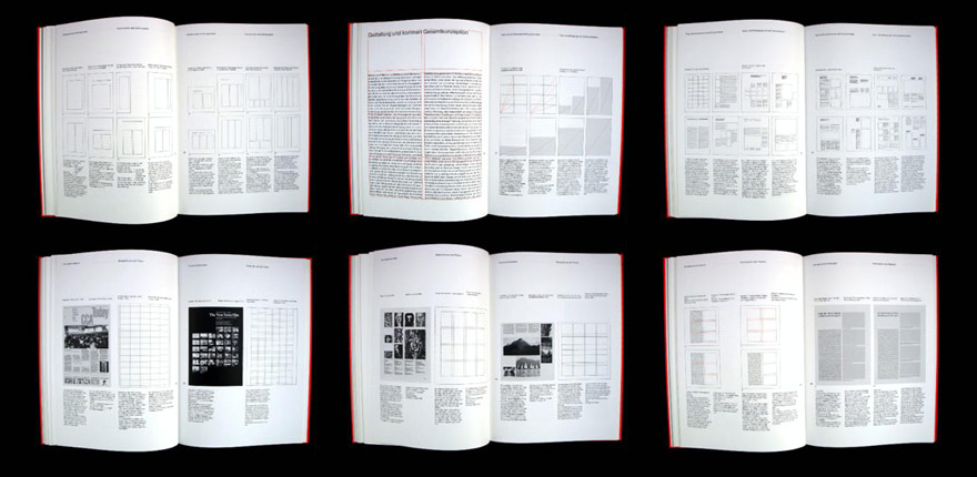
Figure 7 Josef Muller-Brockmann, Grid Systems in Graphic Design, 1961.
Even though Josef Muller-Brockmann’s Grid Systems in Graphic Designwas written in 1961 , it would be considered a definitive publication on grid theory for the next fifty years. And so from the 1960s through the 1980s one can see the invention of several technologies that have affected graphic designers and “the grid,” namely the computer, the Internet, and desktop publishing software.
The Programma 101 (see fig.8), released in 1965, was the first commercial “desktop computer”, but today would usually be considered a printing programmable calculator.
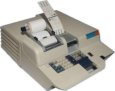
Figure 8 Pier Giorgio Perotto, Programma 101, 1965.
Also, in the 1970s Hewlett Packard introduced fully BASIC programmable computers that fit entirely on top of a desk, including a keyboard, a small one-line display and printer, and by the 1980s, home computers were further developed for household use, with software for personal productivity, programming, games, and desktop publishing; however, in desktop publishing one can see the use of “the grid” emerge and played an important role with digital grids, and grid guides (see fig. 9) in such eventual software programs as Adobe InDesign, Adobe PageMaker, Quark Express Passport, etc.
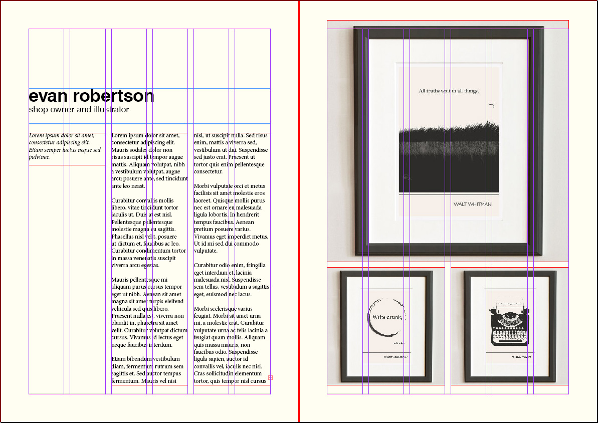
Figure 9 Evan Robertson, Adobe InDesign, 2013.
Then, in early 1980 a newspaper company man named James Bessen founded Type Processor One, an IBM program for WYSIWYG (what you see is what you get) display, which was sold commercially to the public in 1984. So, the ability to create WYSIWYG page layouts on screen, and then print them at a high 300 DPI (dots per inch) resolution changed the graphic design, typesetting, and personal computer industry in a matter of months. Almost every newspaper company in the United States made the switch to desktop publishing based programs from the older inefficient layout systems of the early 1980s.
Likewise, computers were first used to coordinate information between multiple locations in the 1950s, and the U.S. military’s SAGE system was the first large-scale example of such a system. In the 1970s computer engineers at research institutions throughout the United States began to link their computers together using telecommunications technology. The effort was funded by ARPA (now DARPA), and the computer network that resulted was called ARPANET (the Advanced Research Projects Agency Network); in time, the network would spread beyond academic and military institutions and eventually became known as the Internet. And so, one can see with the invention of these technologies – the computer, desktop publishing software, and the Internet – that the field of graphic designer, and visual communication would forever change as design medium switched from paper and press, to home printers and web publishing, and “the grid” would switch to these new technologies as well.
Concurrently, the first publicly available description of HTML (HyperText Markup Language ) was a document called “HTML Tags”, first mentioned on the Internet by Tim Berners-Lee in late 1991, and still to this day is a markup language that web browsers use to interpret and compose text, images, and other material into visual or audible web pages. And so, if HTML (see fig. 10) was the structure of web design, and CSS (cascading style sheets) was the style of web design, then JavaScript is the behavior of web design.
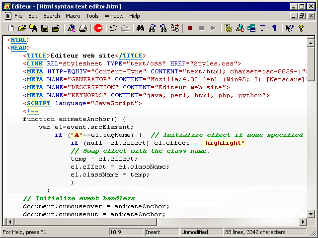
Figure 10 HTML Code, 2013. Pubpages.unh.edu.
All of these – structure, style, and design – were tools that designers have been using since the 1990s to create web design.
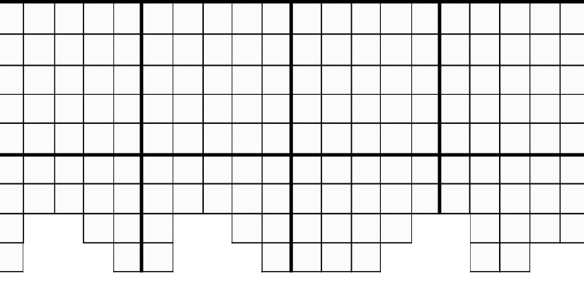
So, just as design, typesetting, and printing historically undergone advancements that streamlined workflow and process, the 960 Grid System (see fig. 11) was an effort that streamlined “web development workflow by providing commonly used dimensions, based on a width of 960 pixels” (Smith) in the 2007.
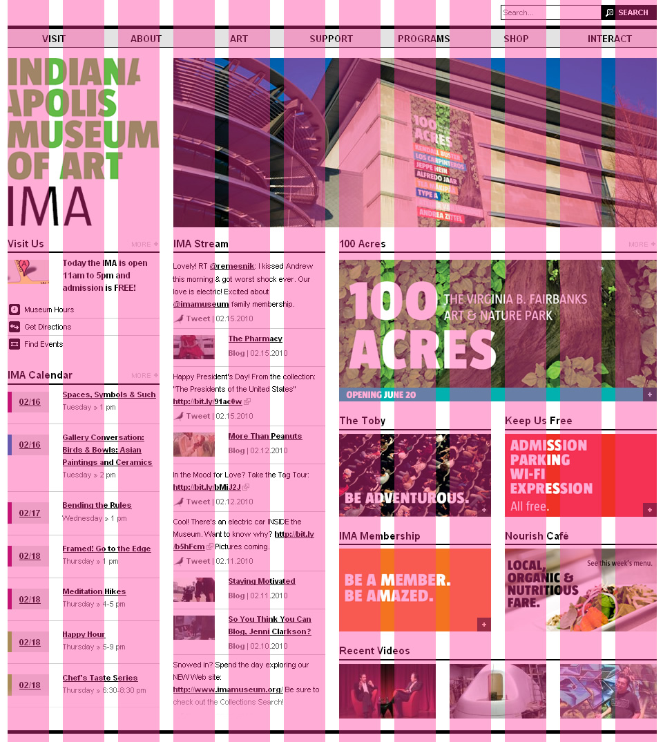
Figure 11 Nathan Smith, 960 Grid System, 2007. http://960.gs/.
This premise of the 960 Grid System, like the historic use of “the grid,” was suited to rapid prototype into a production environment.
The 960 Grid System is now considered antiquated due to analytics provided by World Wide Web Consortium (W3C) that illustrated how desktop and laptop computer screen widths are getting much larger than, and mobile device screens are much smaller than, 1024 x 768 pixels. Consequently, by the year 2013, statistics have shown that more individuals will be viewing the Internet – and concurrently web design – on mobile devices, which challenged designers to even more so abandon the concept of the 960 Grid System, and to look at Responsive Web Design (RESS), or web design that has an adjusting grid to either the device, or the screen dimensions utilized to view the web design. Also, combined with the invention of UX (User Experience Design), operating system development – like Microsoft Windows Metro – which referenced “the grid” and exists on multiple devices (fig. 12), social-design integration, and Augmented reality, a designer more than ever has to explore the evolution of design simultaneously with ‘the grid’.

Figure 12 Microsoft, Windows 8: Metro, 2012. http://www.microsoft.com.
In conclusion, “the grid” has indeed influenced visual art, typography, design, and web development over the course of the 20th century. From the origins of “the grid” before Swiss typography – as it paralleled Constructivism, through Modernism, Deconstructivism, and Postmodernism – it is necessary for designers, typographers, and visual artists to understand the context, design theory, practice, and technological impact of this aesthetic mechanism.
Resources:
“20th Century Research Project.” 20th-century.net . Web. 20 May, 2014. Web. <http://www.20th-century.net/>
Eskilson, Stephen J. Graphic Design: A New History. Princeton Architectural Press, 2009. Print.
Muller-Brockmann, Josef. “Grid and Design Philosophy.” Graphic Design Theory: Readings from the Field. Princeton Architectural Press, 2009. Print.
Neil deGrasse Tyson. “Star Talk Radio.” American Museum of National History. 1 May, 2014. Web. <http://www.businessinsider.com/neil-degrasse-tyson-climate-change-greenhouse-gas-2014-4>
Smith, Nathan. “The Grid System.” Web. Jan. 28, 2013. <http://www.thegridsystem.org/>