Original Post: LibUX
Let’s Redesign a Web Application!
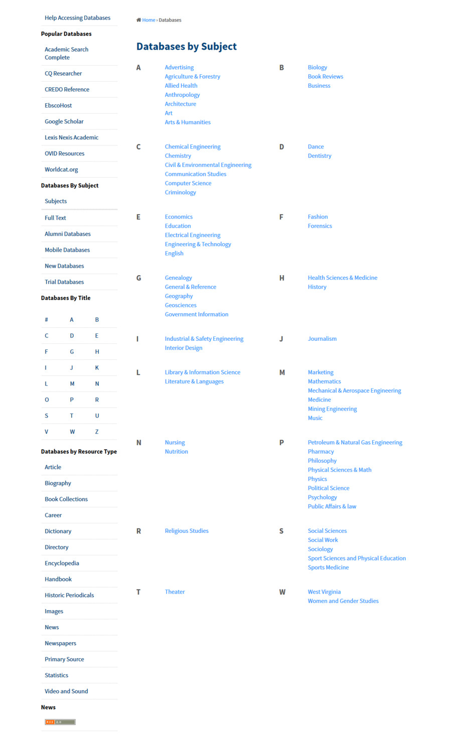
In the spring of 2015 the WVU Libraries development team was called upon by the eResources committee to redesign their legacy Databases web application, which was first started in 1999 and moved to GitHub in 2010.
I was given less than two days to design a databases web application user interface (UI) redesign and present it to the entire eResources committee. This was without any time to establish quantitative design research – analytics, usage data, server-side statistics, etc. – or to conduct any type of qualitative usability testing.
Due to the development team being in constant backlog, being extremely understaffed, and deadlines being decided without our input, it was apparent that this was a UI upgrade only – and we were going in blind. After launch I would be able to conduct summative usability testing.
Four Missed Opportunities
- We didn’t include the user in the process
It was a missed opportunity not only to include the user in the process. By not including the user we couldn’t determine what worked for them, how they used the UI, and what their satisfaction and pain points were. - We hadn’t established any type of quantitative research
We didn’t have any type of quantitative research for the web application (Google Analytics, CrazyEgg, etc.). So we had no quantitative (or qualitative) data on which we could base any UI decisions. - We didn’t use interactive wireframes
I have found that without interactive wireframes stakeholders, developers, and user experience (UX) professionals have very different ideas about how a web application or design should function. Ultimately you can end up with a hybrid or compromised project that is usually subpar to a developers, stakeholder, or client’s expectations. - We launched before we tested
We didn’t conduct any type of user survey or testing on the different interface in a development environment, but instead went live with the intention of testing the live product.
Despite the missed opportunities, the major features and improvements of what was designed and implemented for the web application were:
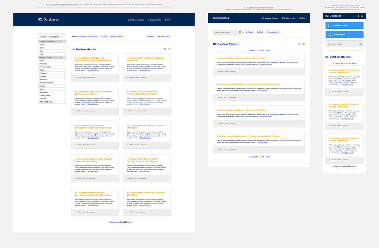
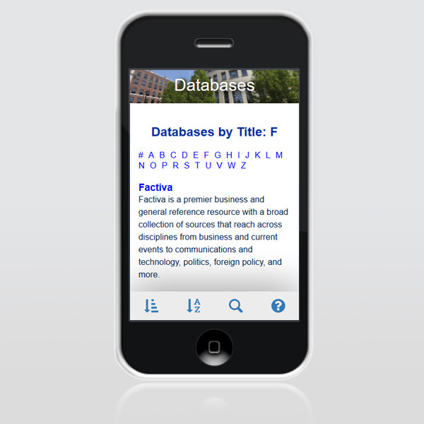
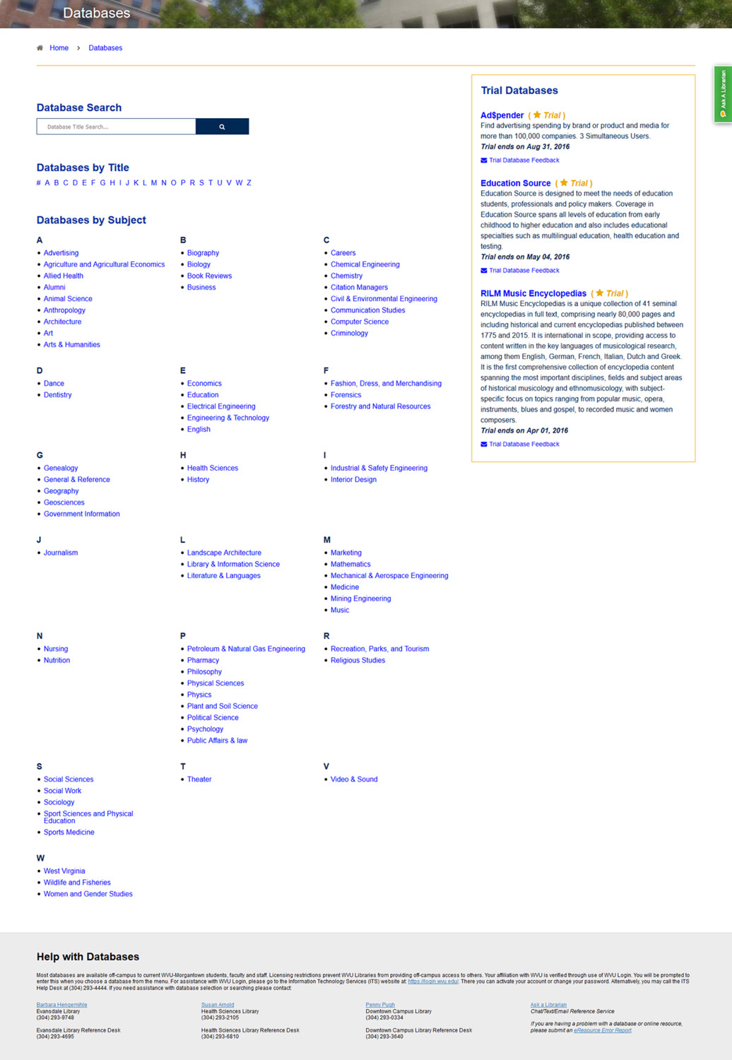
- Being responsive
- Having featured wikilinks for resource and type tags
- A cleaner simpler UI
- A faceted breadcrumb navigation system (similar to online shopping experiences) for titles and subjects.
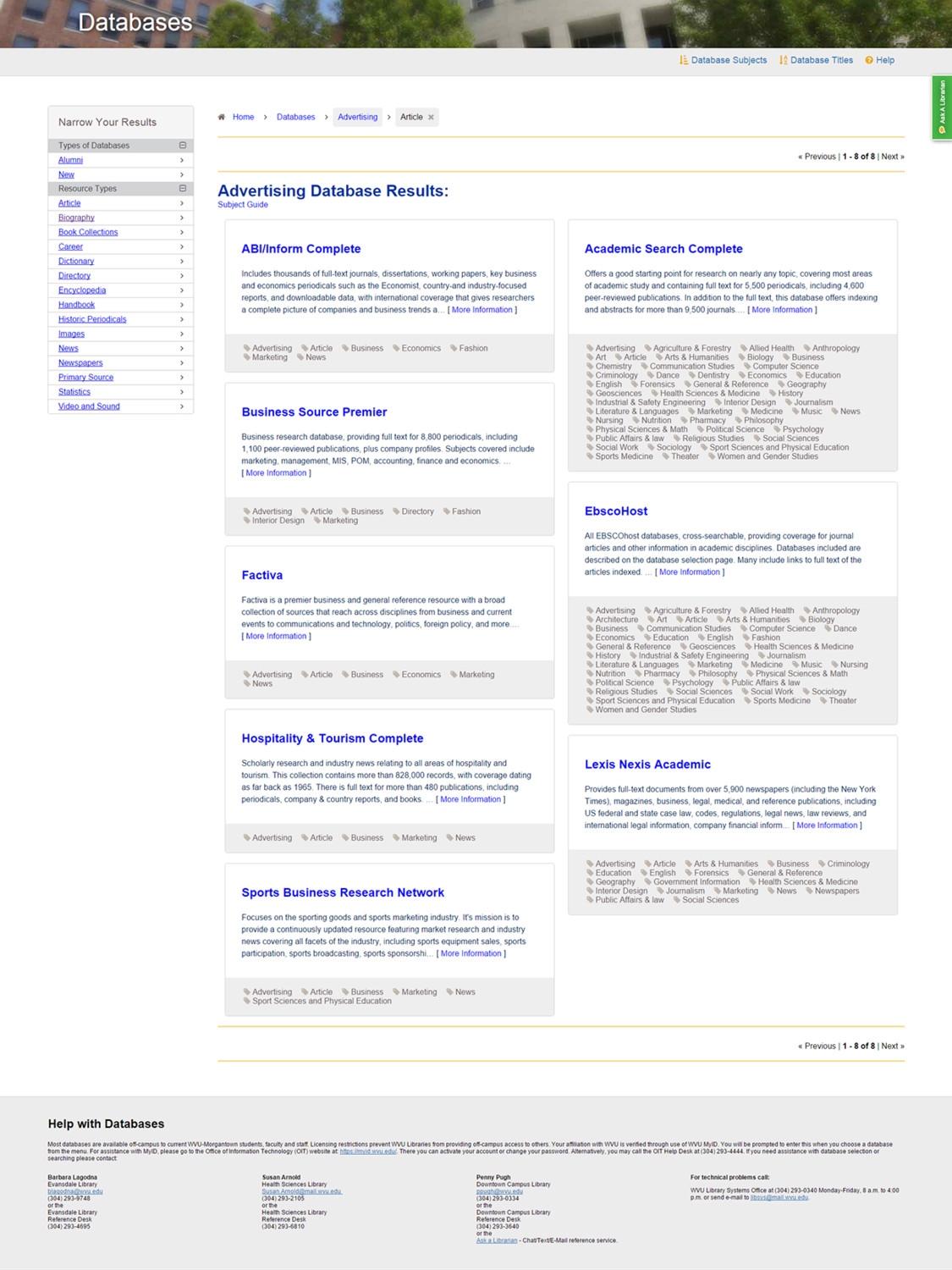
All in all, not too many differences existed between what was proposed versus what was actually designed and built. The only differences include moving to a tabbar-based mobile navigation, on-page help information on every view, and a slightly reduced faceting system from before.
TEST 1: Redesign Usability Testing Results
The committee had requested changes be made on the live product before testing, without knowing the goals and objectives to test in the first place. At this point I stressed that we had no qualitative or quantitative data to go by, and doing some summative usability testing before making any changes was critical. There was a lot of push back on this, and even though I held my ground as a UX professional, I sensed that this was the beginning in a breakdown of communication, understanding, and the user’s role in the development process.
Database Web Application Usability Testing from Tim Broadwater
The Database web application usability results report clarified the web application’s primary target audience as being 73% undergraduate students, 21 years in their average age, 80% of which having smartphones. Additionally the report clarified that 96% of the Database web application usage was from users not actually in the library.
The usability test results demonstrated that as the users spent more time in the web application, it became easier for them to navigate and use. It also indicated that the majority of error rates could be dramatically improved just by making a few UI, content, and development changes. An example of these were changing the locations of certain UI elements, changing some naming conventions, and adding a search box.
It seemed like the blind attempt of redesigning the web application by our UX professional and development team was a success, that we were pretty good, on the right path, and the UI was workable… right?
The UX Conspiracy
I couldn’t have been more wrong. First and foremost the design and UI was not what the stakeholders wanted; they stated that users wouldn’t scroll, that the faceting was too complicated, and that they weren’t happy with the web application. The development team was then questioned as to why we didn’t make the requested changes before testing, to which I responded in kind concerning the lack of user data.
Next we were told that Librarians needed to be involved with the entire Usability Testing process, and what they were seeing users do at the desk and in-person was not what we were designing and building. Finally, it was implied that the UX professional (me) was bending data to fulfill an anti-librarian agenda, push UI elements that weren’t necessary, and not listening to what the librarians thought the users wanted.
I was flabbergasted. Here we had our first insights into how the user interacted with the Databases UI, measurable data to weigh against future summative user testing going forward, and a clear pathway for improvement. However, the stakeholders were claiming data manipulation occurred, stating that users don’t know how to scroll, and exclaiming that it was better before the redesign.
The Breakdown of Communication
We ended up not being able to meet with the eResources committee for three months, during which time the development team was not permitted to make any improvements identified in the usability testing. Near the end of the year, we finally had an hour long meeting with the eResources committee in which we argued the same points, we tried to compromise, but in an entire hour the user was never mentioned or considered once. The conversation had devolved into a blame game.
Later the development team was informed that the eResources committee was possibly moving the Databases web application into another product entirely, unless we built verbatim exactly what they wanted. At this point some on our team became so disgusted with the entire process, and completely excluding the user, that they didn’t care if the eResources committee moved to another product. Simultaneously, other members of the development team who had been working on the web application for years didn’t want to throw away their work, and agreed to do what the committee wanted, even if it meant taking out the innovative and groundbreaking features of the web application (faceted breadcrumbs, wikilink tags, etc.).
During all of this time, I kept thinking “where is the user in this whole process.”
Let’s Re-Redesign a Web Application?
So the development team started work on the second redesign of the Databases web application in the same academic year, and were told that we had to get approval from the eResources committee every step of the way, and that we couldn’t go live without their approval.
This process was a grueling, disheartening, and a morale killer for our team. Mostly because we devolved into a ‘my way or the highway’ work mode, the usability test results were thrown out the window, and we were forced to work along a bulleted list of what we needed to do to get approval to go live. At this point I remembered thinking to myself, “when did I become a mouse the librarians could just click-and-drag,” and asking myself “whose job am I doing, and why am I doing this to our users.”
TEST 2: Re-Redesign Usability Testing Results
On April 15th, 2016 we began conducting a repeat of the usability test from last year, omitting the questions that couldn’t be answered in the changed UI.
Database Web Application User Test 2 from Tim Broadwater
TechSmith Morae was used on a laptop computer to conduct usability testing of the recently revised Database web application, using test questions from the first round of testing that were still relevant to the web application.
When comparing test results from the first Database usability test from the Development team’s redesign, to the re-redesign mandated by the eResources committee, the following occurred:
- 54% of task completion required more time in Test 2 when compared to Test 1
- Success rates for both ‘Completed with ease’ and ‘Completed’ were largely reduced in Test 2 when compared to Test 1
- Success rates for both ‘Completed with difficulty’ and ‘Failed to complete’ largely increased in Test 2 when compared to Test 1
- The standard deviation of error rates have majorly increased in Test 2 when compared to Test 1
Additionally, 70% of the system usability scale responses from Test 1 to Test 2 decreased in favorable response:
- I needed to learn a lot of things before I could get going with this system
- I found the system very cumbersome to use
- I thought there was too much inconsistency in this system
- I found the various functions in this system were well integrated
- I thought that the system was easy to use
- I think that I would like to use this system frequently
What Went Wrong?
Data from the second round of usability testing indicated a False-Consensus Effect (from stakeholder to user), which can be seen in the average time, success rate, and error rate metric comparison. In the field of psychology and UX, a false-consensus effect is a type of cognitive bias whereby people tend to overestimate the extent to which their opinions, preferences, and habits are normal and typical of those of others. Basically, it is assuming that others act and think the same way that they do.
A false-consensus effect is the largest problem and area of concern in the field of UX. It’s the biggest factor that contributes and leads to a decrease in the quality of UX. In the context of the Databases web application, the false-consensus effect was demonstrated when the users that were tested the second time were unable to complete most usability testing tasks because the UI was too simple. The majority of the user’s results ended with a wall of text that took took much time to read through, and the user was unable to facet or filter their search results.
So basically, we redesigned the second time for what the eResources librarians thought the users wanted, and not what actually worked for our 21 year old undergraduate students. At that point I stuck my tongue in my cheek, took a deep breath, and quoted Jakob Nielsen outloud saying, “pay attention to what users do, not what they say.”
Going Forward, Ask Yourself
Now that we are back at the drawing board and looking to bring back some of the features that did work for our users, we have more perspective. We are halting everything because we have learned a valuable lesson. When we think about how we got here, it pretty simple. At every step of the way we all omitted the user from the development process, and at every step the role of the UX professional (me) was devalued and diminished. That’s it, pure and simple. Going forward, and on every project, a UX professional should ask these questions:
Where is the user?
You are not your users, the librarians are not your users, the developers are not your users, and your coworkers are not your users. Have you stopped to do a little bit of work to determine exactly who is your target audience? Once you know that then you know who to include in your testing, not librarians, not staff, and not co-workers. Include the user in the data mining process, the interactive wireframing process, and the usability testing process.
Are we ignoring data?
It’s widely said in UX that if you design for everybody you design for nobody. If you don’t have any quantitative data at all – server statistics, heat maps, analytics, etc. – your UX and usability design research will fail. Don’t blindly ignore test results, or you will blindly ignore your users.
What are we building for?
Do you ever get the feeling that you’re spinning your wheels, and wasting precious development and enhancement time? If you do, then most likely you are. Work smarter not harder by focusing all of your development for your users, and based on formative user data, not whimsical stakeholder requests. Also, if you haven’t read “Why Design-By-Committee Should Die“ by Speider Schneider, go there immediately so you don’t get overpowered by committees.
How do we get everyone on the same page?
To get everyone on the same page before you even touch code, work with interactive wireframes. Corporations and tech startups have been doing this for years, and so it’s time for libraries to do the same. Concept.ly, Pixate, and Principle work very nicely as a collaboration/feedback tools, and Adobe Experience Design just came out for Mac!
In The End, Don’t Sweat It
To some degree we all make mistakes, hindsight is clearer than foresight, and everybody has been guilty of false-consensus effect at one point or another due to deadlines and work constraints. The important thing is to keep good working relationships with people, constantly make a case for good usability by including your users as much as possible, and learn best practices through failure. That’s all that anyone can hope to do.