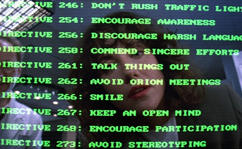
The following are my takeaways for the Neilsen Norman Group’s Usability Week session titled ‘Mobile User Experience’ (Austin, Texas) by Amy Schade. If you’re a mobile webapp/website UX RoboCop, you should know that you have the following prime directives:
- “UX should be useful and usable”
- “Adaptive and responsive can work together”
- “Content strategy in flexbox layouts”
- “Mobile navigation isn’t standard”
- (Classified)
The fact is now that the number of mobile users have surpassed desktop users, it is very important that mobile apps shouldn’t compete with their own mobile websites by offering different experiences; if you are doing both, the options should be the same in both. When you consider that there are both native apps (all on the device) and hybrid apps (part exists on the device, the rest on the web), front-end developers and designers should make the mobile website experience as smooth as the app (and vice versa). Let’s look at the mobile webapp/website UX RoboCop prime directives more closely:
1. UX should be useful and usable
As everything moves from graphic user interfaces (GUIs) to natural user interfaces (NUIs), it’s more important than ever that users know how to use your website in an intuitive way. The big UX-killer here is the onslaught of unfriendly forms as opposed to mobile-friendly forms. I wrote a previous post about this from Joe McGill at HigherEd Web.
2. Adaptive and responsive work together
Adapt technologies traditionally refer to device, OS, or browser detection that exists on the server-side, whereas responsive website design (RWD) fluidly transforms a website for different screen resolutions; however, it is possible to use both of these technologies hand-in-hand to serve streaming video, larger images, or other large assets in reduced size to smaller devices. As long as the images or media are meaningful, they have placeholders, that thumbnails are large enough and legible, and media length is displayed beforehand and doesn’t autoplay.
Also, mobile websites can be smooth as apps just by simply using 3D Transforms, Transitions, and touch-action CSS. These are typically the ‘icing on the cake’ enhancements a designer can make at the end, but these little details do help make the UX more favorable.
3. Content strategy in flexbox layouts
There will never EVER be a replacement for content strategy – pathway mapping, knowing your user’s primary objectives, and establishing online goals and popular resources – so don’t omit this important part of the development process. Also as you may already know, people don’t read on the web at all, they scan… it is a fact! So, being clear and concise with information is more important tan being verbose.
Check out a previous post I wrote about Sara Wachter-Boettcher and content strategy. A content audit may be in order, but once you know what is important, prioritizing that content on a mobile device through flexbox layouts is very easy to do.
4. Mobile navigation isn’t standard
Despite what you may think, what is popular, what A/B testing shows, and what anybody tells you… there is no clear answer on how mobile navigation should work. Drop-downs, tab bars, fly-downs, fly-outs, a large home-page navigation, horizontal and vertical scrolling, hamburgers, left-navs, breadcrumbs, or even a menu button all can work in your mobile website. Successful mobile navigation all depends mainly on your website, your content, and your users. The only thing that is 100% clear is that a mobile website’s navigation should take up less than 40% the device screen, it should employ relevant icons (hamburger icons, not unordered list icons), it should always contain or be positioned next to a non-faceted search, and it should be intuitive and natural to users based on their initial and continued interaction.
More specifically, if there is next, sequential, or similar items in a navigation swiping works well, a lot of structured content works really well in a fly-out navigation, and related content in the form of a sub-navigation can be at the bottom of a page. Find out what compliments your content, and develop what is best for your content.
5. Any attempt to arrest a senior OCP employee results in shutdown
Never, ever do this!